
The finish you choose changes the way color, contrast, shine, and texture are perceived in print. Use this guide to compare the finish options you will see in our product listings.

Luster Photo Paper
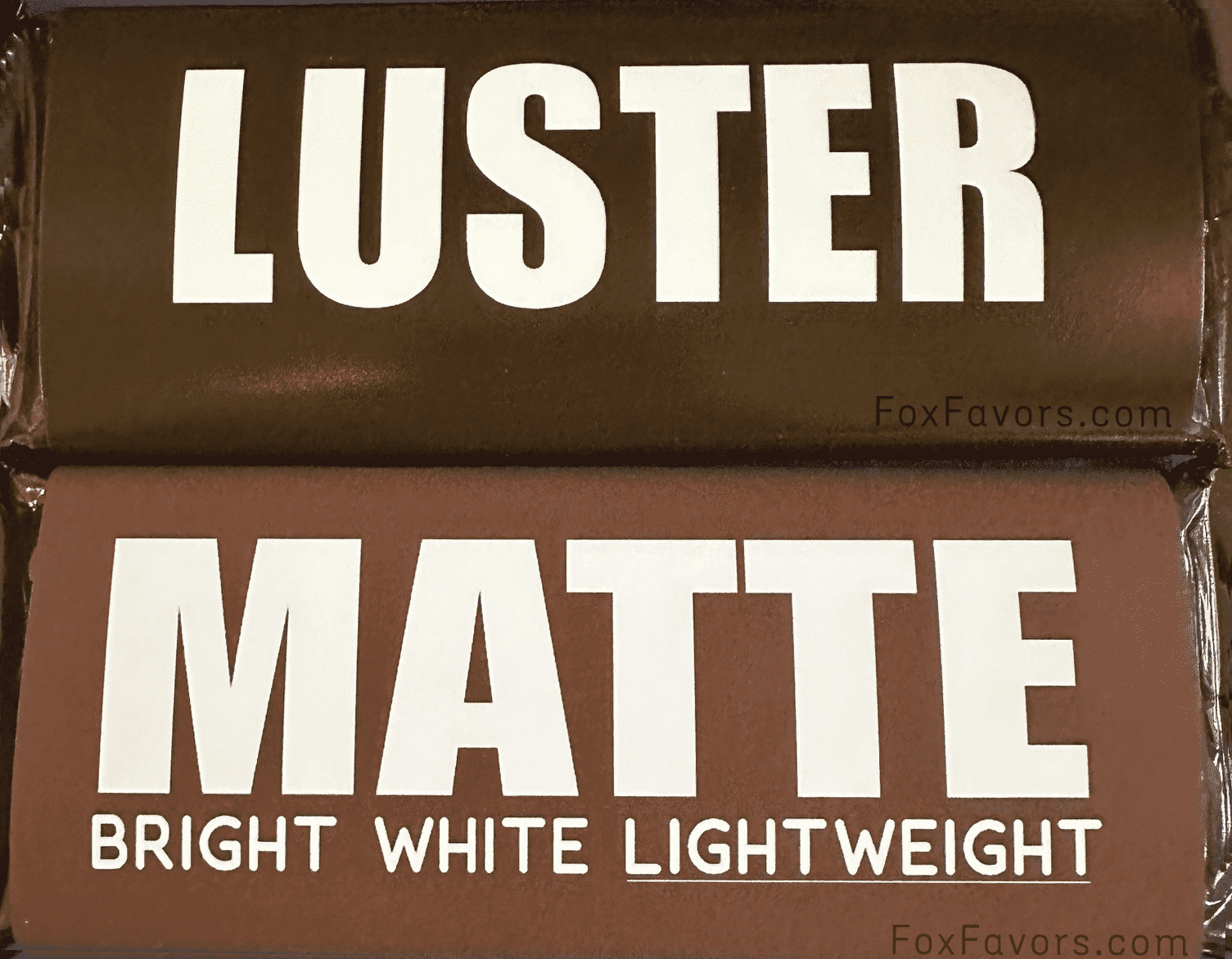
Luster Photo Paper sits between photo matte and photo glossy. It has a fine texture and soft sheen that reduces direct reflection while still allowing contrast, sharp detail, and colors to appear rich and vibrant.
Its lightly textured surface gives it the polished look commonly associated with professional photo-lab prints while also helping disguise fingerprints, minor scuffs, and handling marks better than a smooth glossy surface.
Choose Luster Photo Paper if you prefer:
- Rich, vibrant color without high-gloss shine
- Less glare than Glossy Photo Paper
- Strong contrast and deep colors
- Sharp detail
- A traditional professional photo-lab appearance
- A surface that helps disguise fingerprints and minor handling marks
Balanced choice: Luster is a strong all-around option when you want the richness of professional photo paper with less reflection than glossy.
Glossy Photo Paper
Glossy Photo Paper has a smooth, highly reflective surface that makes colors appear brighter, more saturated, and higher in contrast. Of the finishes, it provides the strongest visual “pop.”
The tradeoff is more reflection and glare, especially under bright lighting or when viewed from certain angles. The smooth surface is less fingerprint resistant than luster or matte.
Choose Glossy Photo Paper if you prefer:
- Maximum color saturation
- Bold, bright colors
- Strong contrast
- Crisp detail
- A shiny, traditional photo finish
Maximum pop: Choose Glossy when vibrant color and shine matter most.

Gloss Labels
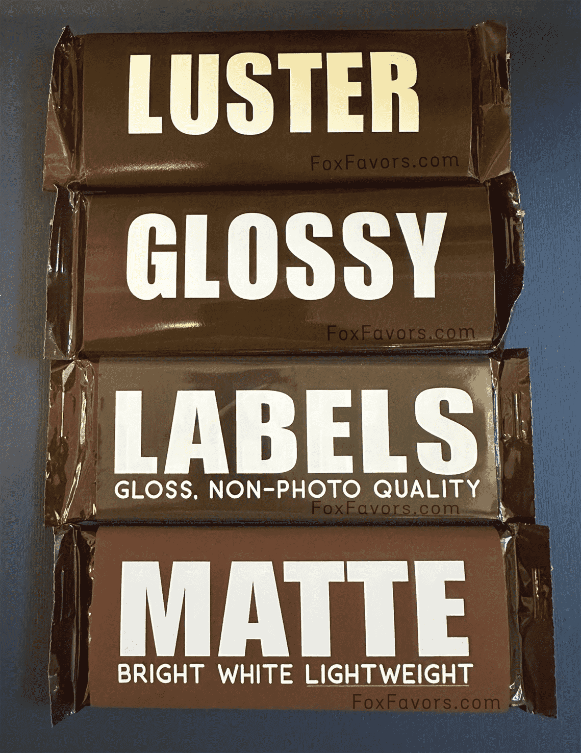
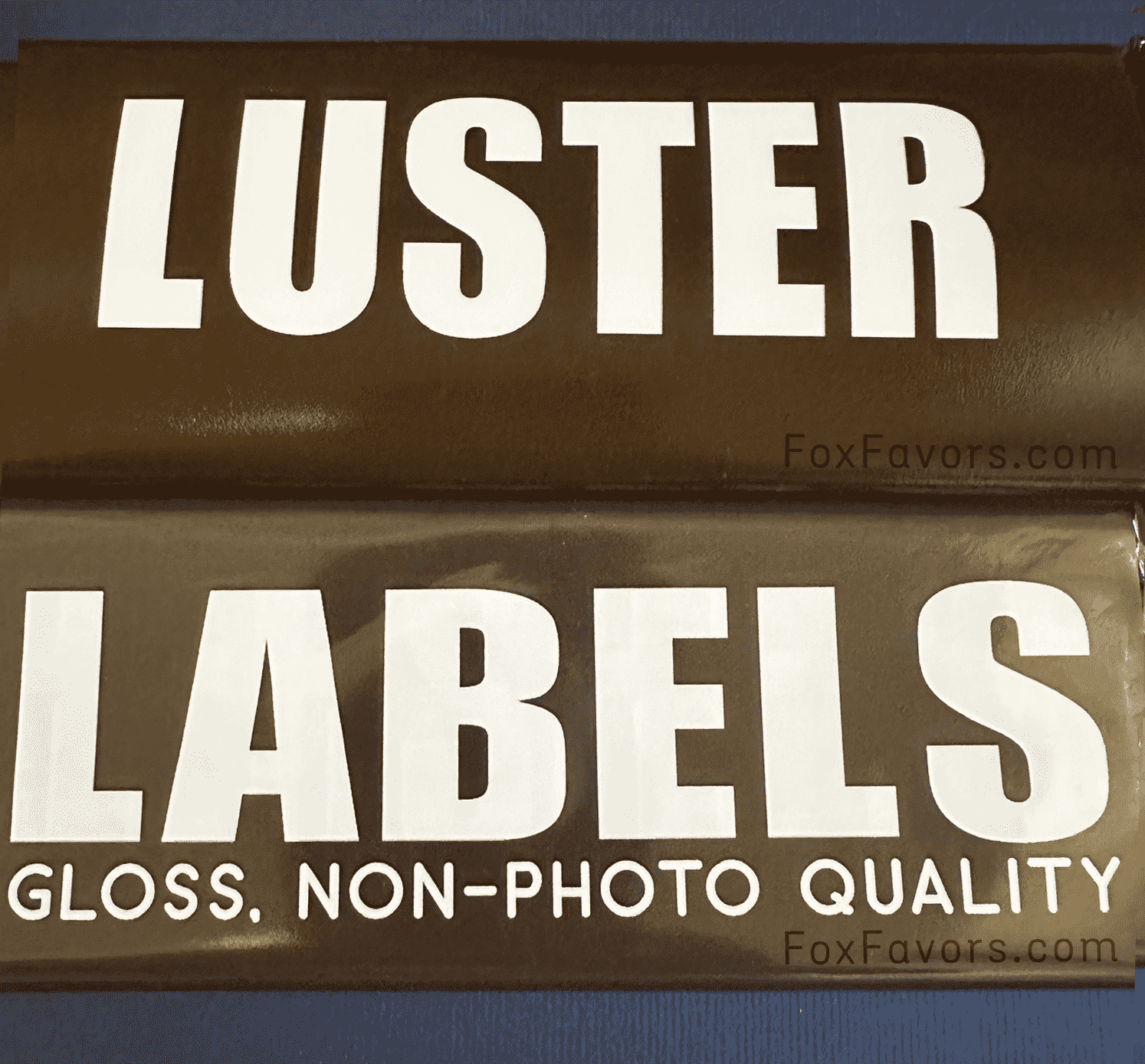
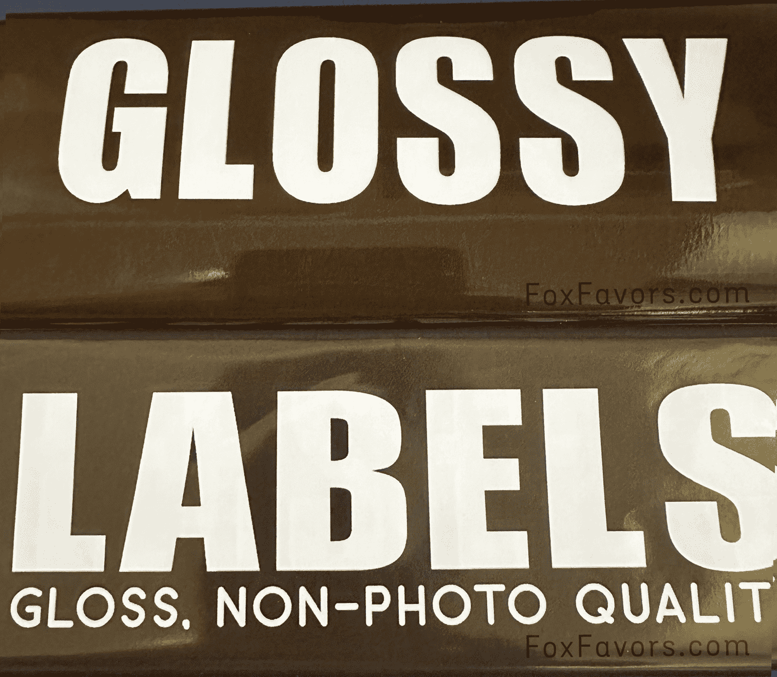
Gloss Labels are a convenient peel-and-stick option with a gloss finish that customers love. While they are not high resolution or photo quality, and they do not reproduce exact (true hex) colors, as you can see in the photos below they still produce attractive, good-looking prints.
Their biggest advantage is convenience: no additional adhesive to apply, since the labels have adhesive backs. Just peel and stick onto favors, jars, bags, and other items.
Choose Gloss Labels if you prefer:
- A convenient peel-and-stick application
- No gluing, double-sided tape, or adhesive dots
- Attractive prints for everyday favors and packaging
Convenient choice: An easy, great-looking way to add a finishing touch.

Bright White Matte Paper
Our most economical paper choice. Bright White Matte Paper is a smooth, lightweight, non-glossy option designed to be cost-effective while still delivering crisp colors and sharp details.
Because the surface is non-reflective, colors have a softer, more understated appearance than they do on Luster or Glossy Photo Paper. It is a practical choice for favors, wrappers, and other printed pieces where value and easy handling are the priority.
Choose Bright White Matte Paper if you prefer:
- Our most affordable, lightweight paper option
- Little to no glare
- A smooth, non-gloss appearance
- Softer, more understated color
- High resistance to fingerprints and easy everyday handling
- Easy viewing under bright lighting or from different angles
Value option: This is intentionally our simpler, lightweight paper selection for customers who want an attractive printed result without paying for a premium photo-paper finish.

Quick Comparison
Want deep, rich color with less glare, fingerprint-resistance, and a professional photo look? → Luster Photo Paper
Want the brightest colors, strongest contrast, maximum shine, and a professional photo look? → Glossy Photo Paper
Want the most convenient peel-and-stick option? → Gloss Labels
Want the least expensive, lightweight, fingerprint-resistant choice? → Bright White Matte Paper

Screen Color vs. Printed Color
The paper finish affects how your eye perceives color and contrast. The same artwork may appear softer on Bright White Matte Paper and more vivid on Glossy Photo Paper even when the exact same colors are used.
Your computer, tablet, or phone screen is illuminated from behind, while printed paper reflects light. For that reason, printed colors will not look exactly the same as colors displayed on a screen.
Real-World Print Photos
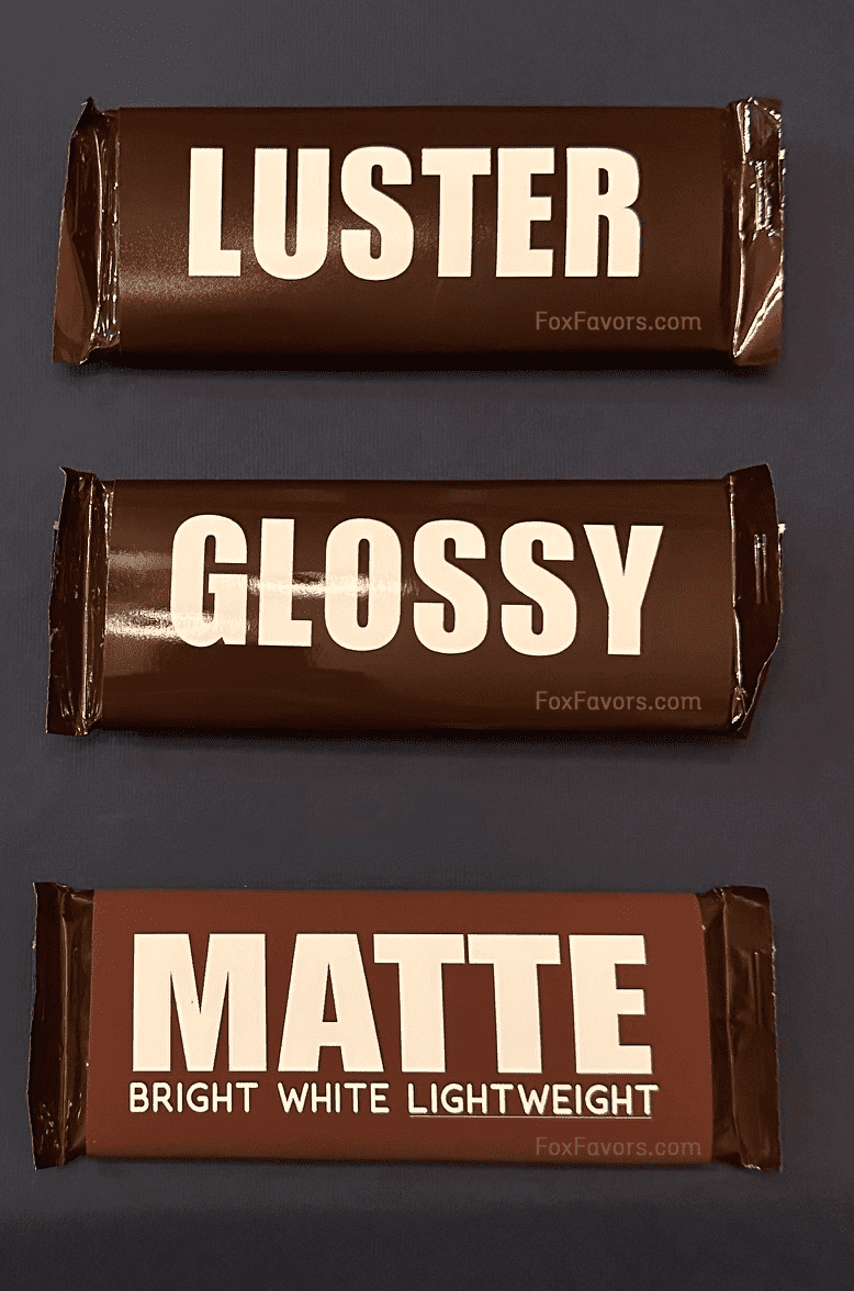
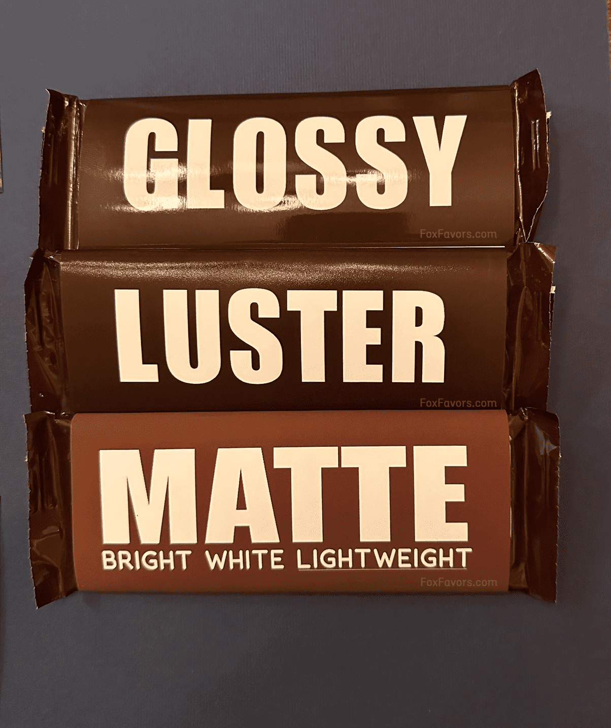
The photos below were taken casually with a smartphone rather than professional studio photography. We include them as a practical, real-world reference for the paper finishes. Lighting, camera settings, and your screen can all affect how the finishes and colors appear in these photos. Tap any photo to open it full size.
Ready to make something special?
Browse our collections to find the perfect finishing touch for your next occasion — or contact us and we’ll help you create exactly what you have in mind.
Learn About Us